Arif Rot is the singer of the spectacular grind band Wormrot(see my Album of the Week post on Dirge
here) and he also is a extremely talented artist(check out his artwork
here). I recently asked him to do a post about some of his favorite album covers, so here it is:
 Insect Warfare - At War With Grindcore
When it comes to black and white artwork, I'm really a fan of the b-grade horror comic style. It adds a raw element which makes it look ultra oldschool. As far as the cover above, this dude probably had his eyes burst inwards right after the very last portion of inking. Not to mention the whole composition of this piece is massive. A balance of white spaces and black ink is incredible in this one. He balanced out the whole perspective which I personally think is fucking hard to accomplish. I have no clue who this dude is but he pull it off agonizingly well. Mad details for a mad ass band = WIN.
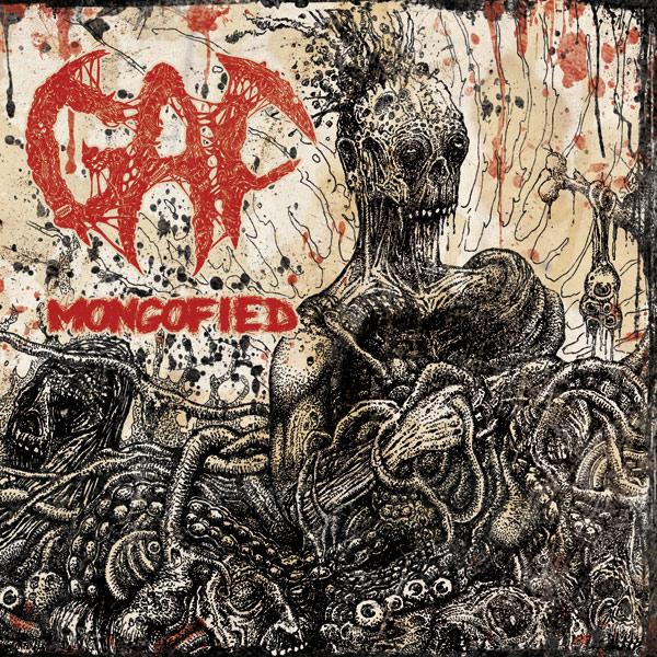
 GAF - Mongofied
I still remember the first time I saw this cover art, I was like, "Duuuudeeee WTF!???". Aziz from Scrotum Jus Records released this album and brought over the high resolution to my place as he needed help creating a promo flyer for it. I couldn't stop staring for like hours. I'm a huge fan of Stippling artworks. The composition for this one is rather abstract yet kinda easy to be playing around with all those guts and glory. The main medium will definitely enhance the piece although you can see it's in a fucking mess. Stippling does the trick. It adds volume to every single detail. It's a pain in the ass for sure but the results are.. Well look at it yourself. I dig how he concentrates more details on the bottom and not much on the top. Amazing.
 Cannabis Corpse - Beneath Grow Lights Thou Shalt Rise
Now this dude is an all rounder. He did the black and white for Wormrot's Dirge cover art, and now this. It's really amazing how he blends in colors like that. I'm not a huge fan of colors when doing any of my works but this hypnotized me to do one. You can basically imagine the whole story of whats happening in the cover before and after the scene. Loud colors on cover artworks can be fucked up, but this master piece kicked me right in the eye. I'm sure you have seen old school horror movie posters right? So just picture this as a movie. Old school? CHECK.
 Putridity - Degenerating Anthropophagical Euphoria
Before I was into grindcore, I was in a brutal death band called Flesh Disgorged. That was during 2004 and I have been a fan of these putrid/gore cover artworks ever since. This dude if I'm not mistaken is from China. Holy shit right? I'm very impressed on how dull yet incredibly sick this is. You can't tell if this was painted in Photoshop, or an actual painting itself. All in all, it looks mighty real. You can't go any grimmer atmosphere than this. His shadings due to the lighting placement is just brilliant, and to pull off that kind of shadings with colors? Goddamn. The perfect brutal death metal album cover artwork of the century period.
 Rot/Life Is A Lie - Split EP
Cut and paste artworks sometimes looks a little awkward; and most of the time people tend to think it's shit because no effort is needed by the artist to execute it, but it takes tons of skills to blend everything. This split release is a great example. Everything falls into place. Nevermind the proportions, different textures, etc. It looks fucking amazing. A different kind of abstract with a message artwork that I really appreciate. This dude is ultra old school.
~Arif Rot